Sticking your tongue out
Designers seem to love these:

See it? That little tongue seems to work its way through the majority of our designs, popping up in all sorts of unexpected places.
Traditionally we would have made it with a background image on the container that pulled some of the background colour of the main page into our box, leaving a tongue of the box’s background colour sticking out. Easy, but fairly inflexible and requires another image download.
Abusing generated content
All lot of you will have played with generated content, but if not a quick recap. In CSS you can define extra content to be pre- or appended to an element. This is useful in and of itself but potentially more useful is that we can style these additional pseudoelements as if they were in the markup, effectively giving us two blank divs inside every element in our page.
These pseudoelements are supported in IE from version 8 and in every other browser, so a couple of years ago I started playing around with them to make our tongues. This could be a little tricky if you’re not familiar with the general idea so I’ll step through it. First, we’ll give our content a height and width, and a background image that’s our tongue. We need to actually give it some content to be able to style it, so I’ve gone with a non-breaking space.
div::after {
  content: " ";
  width: 20px;
  height: 10px;
  background: url(tongue.png) no-repeat 0 0;
}
That gives us a tongue, but at the moment it’s just sitting at the end of our box. Let’s position it:
div {
  position: relative;
}

div::after {
  content: " ";
  width: 20px;
  height: 10px;
  background: url(tongue.png) no-repeat 0 0;
  position: absolute;
  top: -10px;
  left: 10px;
}
By making the parent position: relative our tongue will position itself relative to that. We use top: -10px as that will pull it above the box by its own height, making it sit flush to the top.
This is much better than our first attempt at solving the problem. For a start, we can have a background colour on the box, and a tongue that’s transparent on either side down to the content below. That’s great for popups and draggable boxes. We’ve still got a few problems though. There’s an extra image for users to download, and if you want adjust the size at any point you’ll need to regenerate that image.
Adding borders into the mix
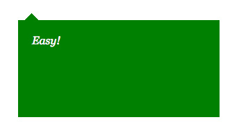
Luckily, it turns out that in a lot of cases we can get rid of the image completely! Our tongue (at least when if comes from my designers) is often triangular in shape which means we can use a very old trick: a judicious application of borders. Let’s rework our previous example. If we assume our box has a green background and we want a green tongue then we can use borders like this:
div {
  position: relative;
  background: green;
}

div::after {
  content: " ";
  width: 0;
  height: 0;
  border-style: solid;
  border-color: transparent transparent green;
  border-width: 0 10px 10px;
  position: absolute;
  top: -10px;
  left: 10px;
}
Easy enough? First, we set the width and height of our generated content to 0. We’re going to build the tongue out of borders so we don’t need any size to the box itself. Next, let’s think back to our image box. It was 20 pixels wide and 10 high. To get this, let’s have a border that’s 0 pixels high on the top, 10 on the right, 10 on the bottom and 10 on the left. Finally, we set out border colour. The top is 0 pixels high so we could put anything we want there, but let’s leave it as transparent for clarity. On the left and right we want to be able to see down to the content so we need those to be transparent too. Finally, we make our bottom triangle of border the colour we want: green.
Now that we’ve got our tongue as a separate pseudoelement we can do all sorts of cool things with it. How about changing the color of the box and the tongue at the same time on hover?
div:hover {
	background: blue;
}

div:hover::after {
	background: blue;
}
Doesn’t get much easier. What about increasing the size of the tongue on hover with a slight transition?
div::after {
	transition: border-width .2s, top .2s;
}

div:hover::after {
	border-width: 0 15px 15px; top: -15px;
}
(Obviously you’ll need to add your favourite vendor prefixes here)
Have a play around, and if you come up with anything cool let me know!