Making radio buttons and checkboxes easier to use
At GDS we’re always looking for ways to make our pages easier for anyone to use. One particular area that comes up in user research is the difficulty people have with clicking on small checkboxes or radio buttons in forms. Our standard library of form elements does contain them in a clickable grey box, but because the relation between the label and the control has to be manually coded, every website that doesn’t do this trains people to only click directly on the control. It would be nice if we could adjust the size of checkboxes and radio buttons to make them larger where appropriate.
A while ago, Roger Johansson wrote a set of articles where he investigated how form controls could be styled. This highlighted some difficulties in resizing radio buttons and checkboxes. I was interested in whether anything had changed since this was written.
Generally when you find a set of visual differences between browsers the first place to turn is the specifications. Somewhat unhelpfully though, CSS2.1 has this to say about form styling:
CSS 2.1 does not define which properties apply to form controls and frames, or how CSS can be used to style them. User agents may apply CSS properties to these elements. Authors are recommended to treat such support as experimental.
I’d like to say that things have changed since CSS2.1 was published, but there’s precious little in CSS3 beyond very basic layout hints.
If the specifications don’t tell browsers what to do, maybe they’ve settled on an unofficial standard between themselves? I put together a quick test page with radio buttons and checkboxes set to varying different sizes and ran it through a set of browsers to see what they made of it. With evergreen browsers I only tested the latest version. The results are in the following table if you want a more detailed view each image links to the full size version.
| Browser | Result |
|---|---|
| Chrome on Windows 7 | 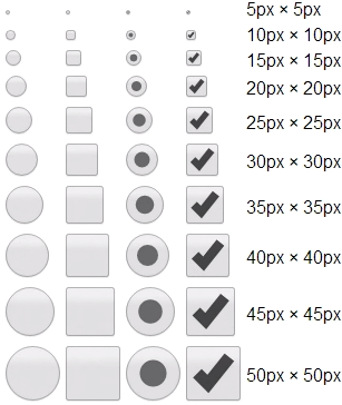 |
| Chrome on Windows 8.1 | 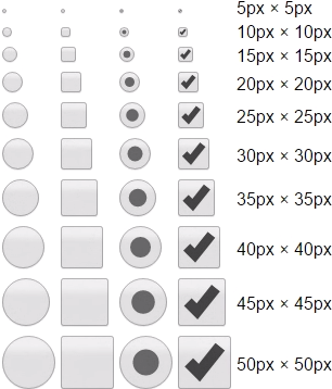 |
| Chrome on Windows 10 | 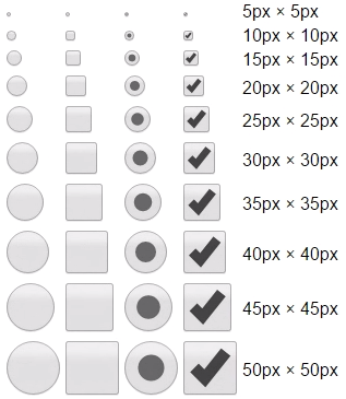 |
| Firefox on Windows 7 | 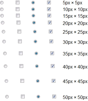 |
| Firefox on Windows 8.1 | 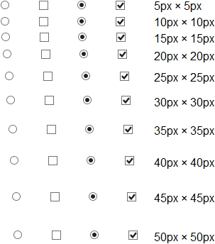 |
| Firefox on Windows 10 | 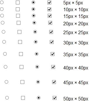 |
| Opera on Windows 7 | 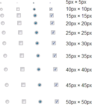 |
| Opera on Windows 8.1 | 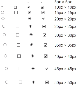 |
| Opera on Windows 10 | 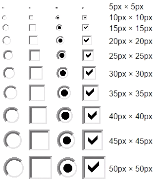 |
| Internet Explorer 7 on Windows XP | 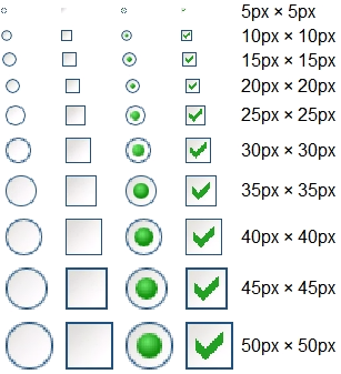 |
| Internet Explorer 8 on Windows 7 | 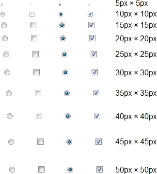 |
| Internet Explorer 9 on Windows 7 | 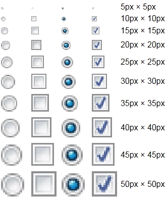 |
| Internet Explorer 10 on Windows 8 | 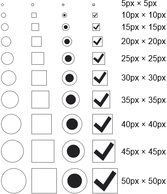 |
| Internet Explorer 11 on Windows 10 | 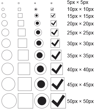 |
| Edge on Windows 10 | 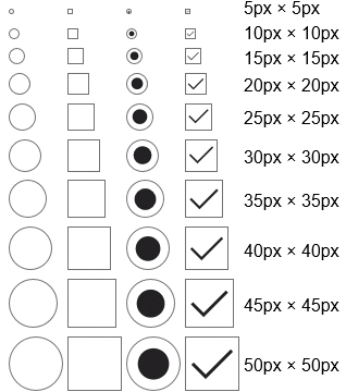 |
| Chrome on OS X 10.10 | 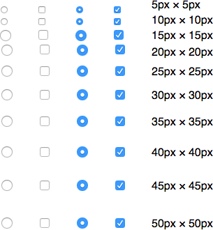 |
| Firefox on OS X 10.10 | 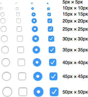 |
| Opera on OS X 10.10 |  |
| Safari on OS X 10.10 | 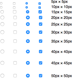 |
| Safari on OS X 10.11 | 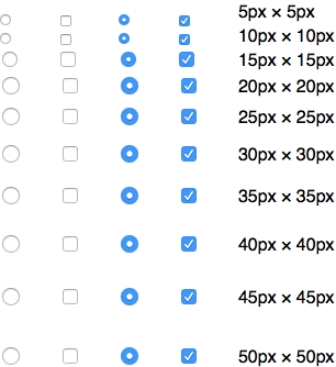 |
| Chrome on Android 4.4 | 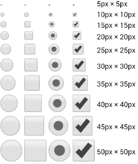 |
| Chrome on Android 5.1 | 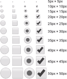 |
| Safari on iOS 6 | 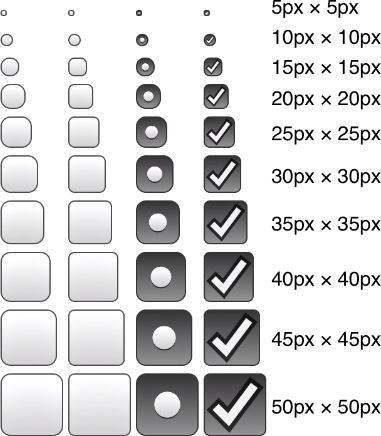 |
| Safari on iOS 8.3 | 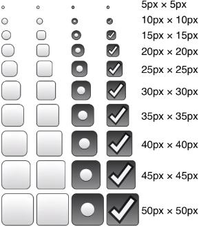 |
| Internet Explorer on Windows Mobile 8.1 | 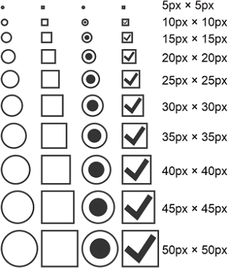 |
| FirefoxOS 2.2 | 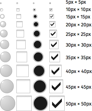 |
These results fell broadly into three different categories.
No change in rendered size
- Firefox on Windows
- Opera on Windows 7
- Opera on Windows 8.1
- Internet Explorer 8 on Windows 7
- Chrome on OS X
- Opera on OS X
- Safari 8 on OS X 10.10
- Safari 9 on OS X 10.11
Sized, but pixellated or blurry
- Internet Explorer 7 on XP
- Internet Explorer 9 on Windows 7
- Firefox on OS X 10.10
Sized and crisp
- Chrome on Windows
- Opera on Windows 10
- Internet Explorer 10 on Windows 8
- Internet Explorer 11 on Windows 10
- Edge on Windows 10
- Chrome on Android
- Safari on iOS
- Internet Explorer on Windows Mobile 8.1
- FirefoxOS 2.2
There are some oddities with the above results that are worth mentioning.
The browsers that display no change in the size of the rendered button always create a blank space of the specified size and centre the input within it. Even if the size of the control isn’t changing you can rely on the rest of your content being laid out consistently.
The WebKit (and Blink) based browsers on OS X do resize in one case: they’ll drop to a smaller checkbox or radio button when set to below 14 pixels wide and high.
Safari on iOS has set the corner radius of radio buttons to a fixed number of pixels. When you increase the overall size of the control the corners stay at the same radius, which makes the control look progressively more square. Even at 50px × 50px it’s distinguishable from a checkbox, but this feels like an issue that could be easily fixed.
Opera on Windows 10 for some reason uses Windows Classic themed controls. It doesn’t look awful and it does resize up nicely at least, but given that the default Windows 10 controls look really good at any resolution I’d suggest this could be changed easily.
Where does this leave us?
The mobile browsers I tested have the least problems: perhaps due to the nature of a zoomable interface by default they all use vectors that scale nicely. On desktop, support for resizing is difficult to untangle. Browsers on Windows 10 (apart from Firefox) generally do a nice job which is positive for future development, but on OS X it’s completely the opposite with only Firefox supporting resizing (and even then blurring the resized controls).
If we want even basic support for resizing radio buttons and checkboxes on desktop, we'll need to speak to the browser development community to have a better understanding on what’s feasible and sensible.